ESMO Congress 2026 filled IFEMA Madrid from 23 to 27 October (IFEMA). Understandably, most write-ups will focus on the data presented in the session halls. This article is about the exhibition floor: how companies used one of oncology's biggest stages, what drew people in, and what they walked past.
As a medical animation studio, we make many of the films, mechanism of action (MOA) animations and interactive pieces that end up on these screens. So ESMO is a great chance for us to watch our audience in the wild. How long do people stay with a video? Which visuals draw them into a booth? How many taps do they make before they move on?
1. Be seen from across the hall
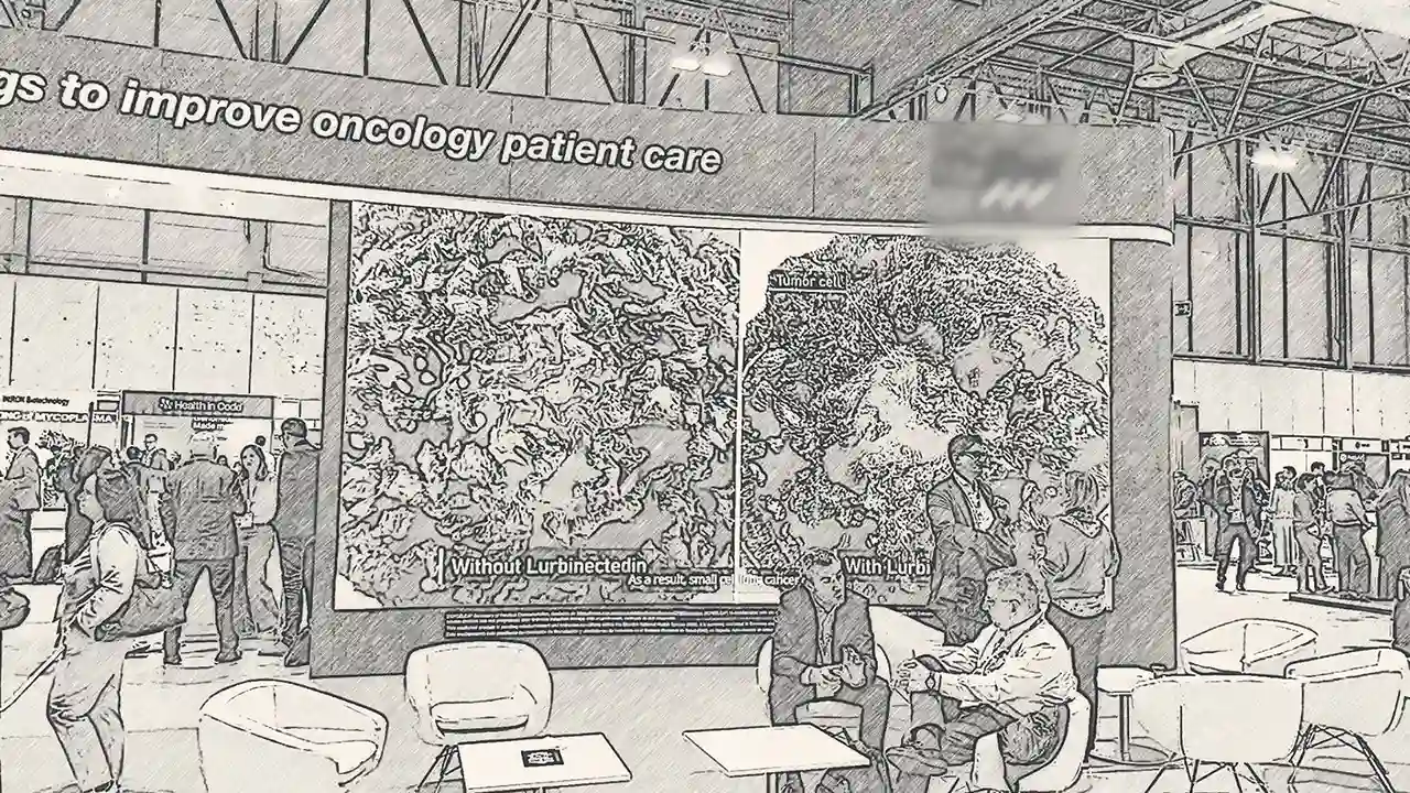
At a congress this size, most people first see your booth from 20 metres away while walking to a session. The booths that worked had bold, simplified visuals and one message that could be read at that distance.
- Use scale to make the point. One of the most effective displays was a huge split screen: the same tumour image shown "without" and "with" treatment, side by side. You understood the story before you were close enough to read the small print.
- Repeat the message. Several screens showing the same or synchronised content draw the eye far better than lots of screens all competing with each other.
- Give it a focal point. Some of the largest booths felt overwhelming, with so many screens, zones and messages that there was nowhere obvious to look first. Before you sign off a design, ask what a visitor should see first.
- Light the floor. People noticed lighting at floor level far more than lighting rigged high up near the ceiling. Light set into the floor or the base of the booth guides feet as well as eyes.
[[related-case-study]]
2. Break out of the rectangle
Screens don't have to be rectangles. In a hall full of 16:9 panels, a different shape is often the thing that makes people turn their heads.
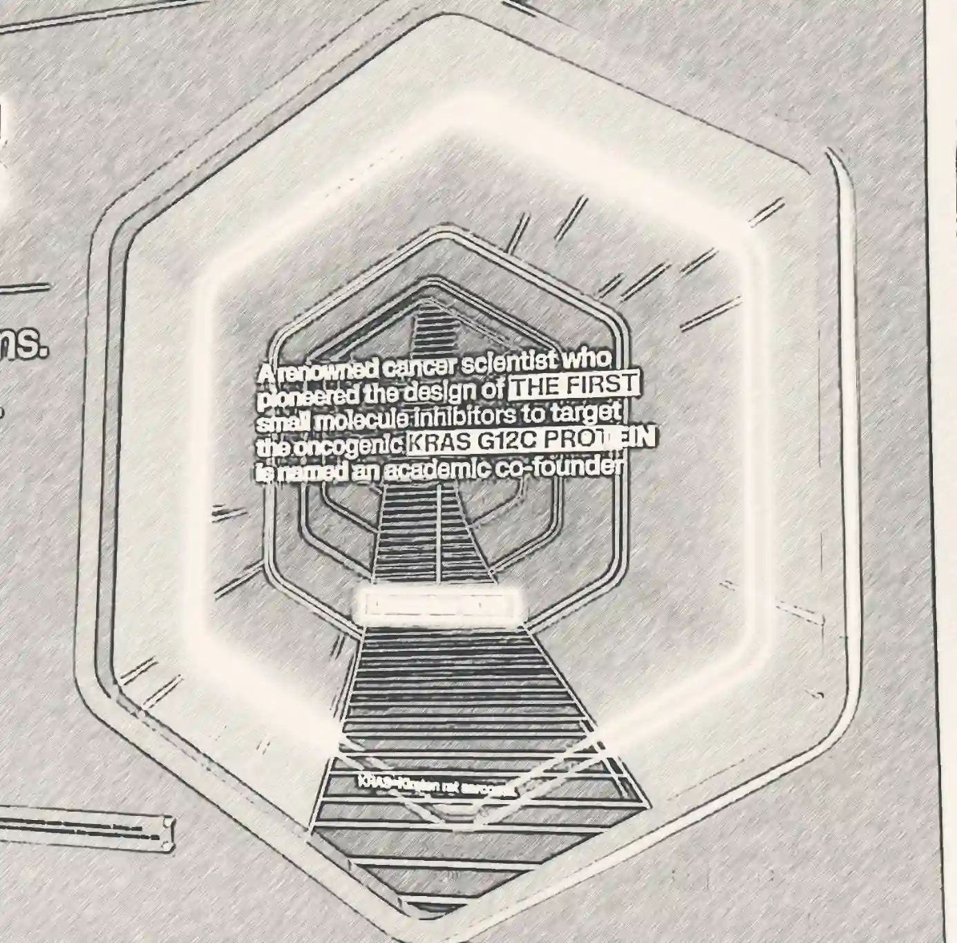
One booth framed its screens inside glowing hexagons, including an LED "tunnel" that seemed to pull you through the wall into the science. It was striking, unusual and instantly recognisable, so it doubled as a way to find the booth again.
Smaller touches worked too. A screen set inside a simple wooden frame felt more like a picture on a wall than a monitor, which suited a calmer, more conversational space. Shaped screens, frames, cut-outs and projection onto curved surfaces all help your content look designed for the space rather than added to it.
3. Technology should earn its place
There was no shortage of technology at ESMO 2026: hologram fans, touchscreens, VR headsets, 3D-printed models and interactive floors. The question we kept asking was what each one added to the experience. Why use a hologram fan rather than a projector? If you can't answer that, the technology is decoration.
A journey you can walk. One of the most ambitious pieces turned a treatment’s intended outcome into something you could physically experience. Visitors walked along an interactive floor and up a set of steps towards “cancer-free survival”, with the film responding as they moved. It’s a memorable way to make an abstract endpoint feel tangible: progress you can literally take steps towards. A few touches can help ideas like this reach even more people:
- Invite people in. A host, or a clear cue on the floor, tells visitors it’s interactive and that they’re welcome to step on.
- Make the payoff quick to reach. A short path means more visitors reach the end in the 30 seconds or so they have to spare.
- Be open about how it’s made. The film blended live action with AI-generated footage. AI can be a fast way to create rich visuals, and saying you’ve used it builds trust with a scientific audience.
Physical models: look, or touch? Several booths used large 3D-printed molecules, including an antibody displayed behind glass. It was eye-catching, but it raised a question: what does a model behind a screen add that an animation doesn't? Its real advantage is that it's physical, so let people pick it up, turn it over and see how the parts fit together.
When it works, it's built in. The most successful uses of technology felt part of the booth rather than added on: 3D-printed assets built into the furniture, and a touchscreen library of MOA animations that let visitors choose what they wanted to see.
4. Bring the pipeline to life
A pipeline is usually shown as a chart: rows of compounds, phases and indications. It's important information, but on a booth wall it's easy to glance at and forget.
The more memorable approaches turned the pipeline into a journey. Visitors could walk through it, explore one programme at a time, or see the science behind each stage animated alongside the data. Several medical affairs areas paired a large, simple headline number (the total count of projects, then a split by stage) with comfortable seating nearby, so the pipeline became a conversation starter rather than a wall of text.
If your pipeline is the story you want to tell, ask how a visitor could move through it, not just read it.
5. Low-tech wins
For all the LED walls and interactive kit, some of the most effective ideas cost very little.
- The coffee machine still reigns supreme. Coffee was so central to the exhibition that one oncology news site published a guide to where to find it at ESMO 2026, listing more than 20 booths serving it, along with lemonade, sweets and games (OncoDaily). A queue for coffee is a captive audience with five minutes to spare.
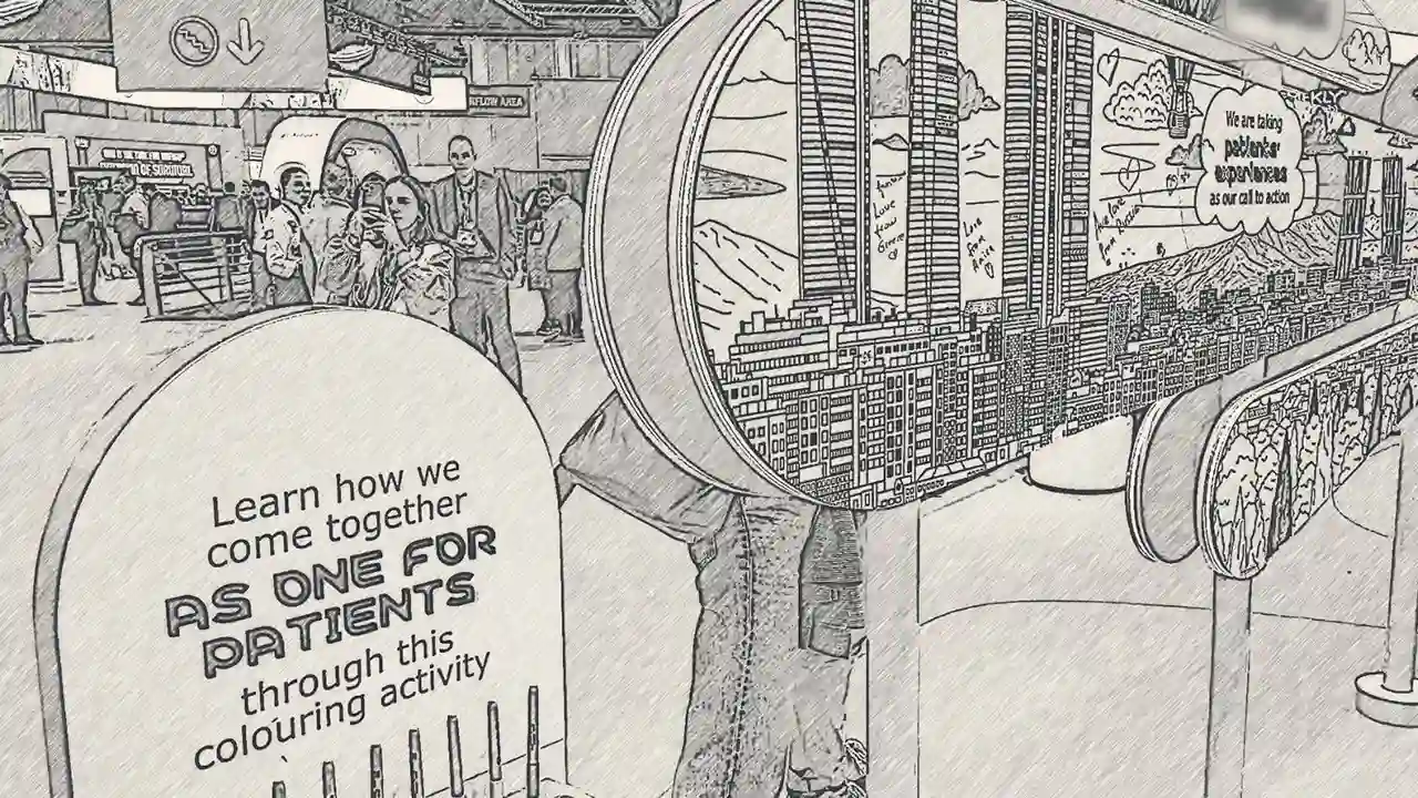
- A simple colouring exercise drew people in and kept them there. It's tactile, calming and easy to join, a welcome change from five days of screens.
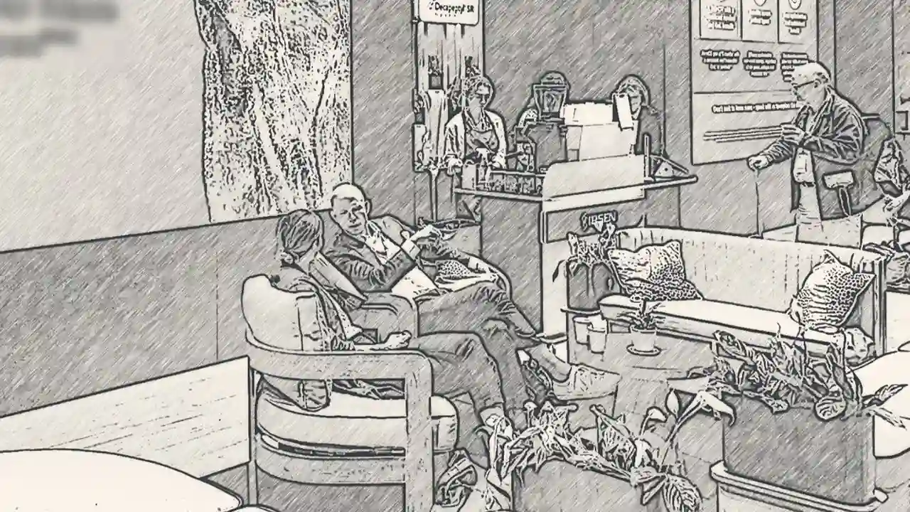
- Somewhere comfortable to sit. Booths with soft seating, plants and a lounge feel were consistently full. Tired delegates will stay where they're comfortable, and that buys you time for a conversation.
- Photo opportunities. A professional headshot station gives people something useful to take away and a reason to stop.
Planning for 2027: a quick checklist
If you're briefing a booth for next year's congress season, these are the questions we'd ask:
- Can the main message be read from 10 metres away?
- Is there one clear focal point?
- Do the screens reinforce one message rather than compete?
- Could a screen be a shape other than a rectangle?
- What does each piece of technology add that something simpler couldn't?
- Can people touch it?
- Will visitors actually finish the interactive?
- If you've used AI, have you said so?
- Is the pipeline a journey or just a chart?
- Is there somewhere comfortable to sit, and is there coffee?
Most of all, it's about the people
For us, the best part of ESMO wasn't any single booth. It was meeting people we'd only ever seen on Teams calls, and having conversations that went beyond the agenda.
It was also a chance to see how people actually use the materials we create. We could stand to one side and watch how long someone stayed with a video, which visuals caught their eye, and how many taps they made on an interactive before moving on. That's feedback you can't get any other way.
Perhaps that's why the coffee booths are always so popular. They aren't really about the coffee. They create a reason to pause, stand next to someone you've never met and start talking. Some of the most interesting conversations at any congress begin in a coffee queue, with a chance connection nobody planned.
When it comes down to it, people are the common ingredient. The way they interact with each other and with patients drives the success of a conference booth, of a message, and of the collaborative teams that patients need. The technology, the screens and the clever builds are only there to bring those people together.
[[related-blog]]